
Streamlining Health Resource Access:
A UX Overhaul of the AboutKidsHealth Teen Website
UX & UI Design
UX Research
User Testing
TOOLS USED
Figma, Adobe Illustrator, Google Forms, Zoom
OVERVIEW
The product I was designing for was the AboutKidsHealth Teen (AKH Teen) website, an online health hub developed by SickKids Hospital. This trusted platform provides articles, videos, and tools to empower teens, parents, and caregivers to make informed decisions about health. My work focused on improving the site’s usability, search functionality, and overall design. This included making the content more accessible to a diverse audience while maintaining consistency with the AboutKidsHealth brand and creating a visually engaging user experience.


AKH Teen website’s original homepage

AKH Teen website’s redesigned homepage
Brief
Users were struggling to find the content they needed because the website lacked a search function. Feedback increasingly highlighted user frustration when navigating the site to locate specific resources. Stakeholders recognized this as a critical issue and prioritized it for resolution. Our primary goal was to introduce and optimize a search function to help users quickly and easily access the resources and information they needed to support their health journey. Our secondary goal was to enhance the design and layout of the website to reflect a visual identity that spoke to our target market. This meant that we had to re-structure the content and layout in categories that represented the audience.
Roles and Collaboration
I collaborated with key team members to ensure the project’s success:
Content Editor: Assisted in conducting research, including gathering feedback from target user groups.
Product/Project Manager: Oversaw project coordination, ensuring alignment with user needs and business objectives.
Front-End Developer: Translated designs into responsive, interactive web pages.
My responsibilities leveraged a variety of skills:
Research: Conducted user interviews, surveys, usability testing, and competitive analysis to understand user needs, behaviours, and pain points.
Design: Used research insights to create user flows, wireframes, and prototypes that improved the overall user experience.
Visual Design: Designed the product’s visual interface to ensure it was aesthetically pleasing, consistent, aligned with the brand identity and reflected teen health design trends v.s. the outdated existing design.

This user journey map highlights how the project was structured around solving key usability issues and improving the overall user experience, ultimately helping users find relevant health resources in a more intuitive and efficient way.
Target Audience
Teens who are Interested in learning about health topics
Healthcare Providers who are sharing reliable and relevant health resources with their patients & caregivers
Secondary audiences: Parents, caregivers, and healthcare providers seeking reliable resources.
User Needs
Clarity and Simplicity: Content presented in simple, easy-to-understand language.
Accessibility: Easy-to-find information via intuitive navigation or search, with compatibility across devices (mobile, tablet, desktop) and adherence to accessibility standards.
User Pain Points
Difficulty Finding Information: Poor organization and lack of a search function hinder users from locating resources.
Inadequate Design: A visually unappealing, inconsistent design with limited interactivity can disengage users.
Takeaways
The introduction of the search function directly addresses the key pain point of difficulty in finding content.
The reorganization of navigation improves content discovery and reduces cognitive load, allowing users to access information more easily.
By focusing on task completion and user satisfaction, the redesign aims to reduce user frustration and increase engagement with the website.

High-fidelity mockups of the new user interface showcased several key improvements: the addition of a navigation bar with clearly defined categories for easier exploration, two strategically placed touch points for search functionality to enhance accessibility, meta tags and icons to help users quickly identify the category and type of content, and an interactive learning section prominently positioned to align with user preferences and habits. The design also featured a thoughtfully curated colour palette that resonated with the target audience and reinforced brand identity, while adding visual appeal and interest.
Project Goals
Improve Usability: Enhance navigation and introduce a search function to make content discovery seamless.
Refine Design: Develop an interface and visual style that resonates with the target audience while staying consistent with the AboutKidsHealth brand.
Success Metrics
The success of the project was measured by how well it addressed user needs and achieved organizational goals such as improving content accessibility and user engagement. Key metrics included:
Search Usage Rate: Tracked through Google Analytics to measure how often users utilized the new search function.
User Feedback Surveys: Gathered qualitative feedback to assess whether the implemented changes were helpful, intuitive, and met user expectations.

Problem Definition
The redesigned website aimed to address two primary user challenges: the difficulty of easily finding relevant information and the lack of interest in exploring additional content due to poor visual design. These issues were identified through user feedback and analytics, which highlighted frustration with the site’s usability and navigation.
From the organization’s perspective, the AboutKidsHealth (AKH) Teen website faced low engagement due to an unappealing design and a poor user experience. The existing website had been developed under tight time constraints, leaving little room for strategic planning or user-centered design. Over time, this led to a website that didn’t resonate with its target audience. The project was deprioritized until a key stakeholder recognized the need for improvement, especially as new teen-focused content was being added.
It became evident that the content structure was not tailored to the primary audience, and significant changes were needed to make it more accessible and engaging. As part of our research, we held conversations with healthcare providers who regularly used the website as a resource for their patients and families. These discussions explored how the site’s current format either supported or hindered its utility, and what improvements would make providers more likely to recommend it to their patients.
By addressing these issues, the project aimed to create a user-centred, engaging, and easily navigable website that met the needs of both users and organizational goals.
Research
Primary Research
As part of our research, we conducted an online questionnaire with 16 pre-teens and teens to gather insights on how they consume health-related content, particularly for the mental health portal of the website. Our goal was to understand their online behaviors, preferred platforms, and the mediums they trust for health information. The content editors and I collaborated on developing a set of targeted questions, which we distributed via Google Forms.
Key Findings from User Interviews:
37.5% of participants were 13 years old – indicating a need for content that appeals to younger teens.
31% reported using the internet or apps randomly to find mental health resources – suggesting the importance of improving searchability and intuitive navigation.
87.5% primarily use mobile devices for online searches – reinforcing the need for a mobile-first design approach.
56.3% had not been diagnosed with a physical health condition – emphasizing that many users may be seeking preventative or self-education content rather than treatment-focused resources.
100% of participants use YouTube as their main social media platform – highlighting an opportunity to integrate video-based learning and multimedia content.
Positive feedback on the site’s layout and colour choices – users found the structure appealing but noted that some content felt too text-heavy and lacked engaging visuals.
These insights played a critical role in shaping our design decisions, ensuring that the final product aligned with how teens prefer to access and consume health information.
Competitive Analysis
Since the existing site did not reflect the structure, tone, or visual appeal of a teen-focused health website, I conducted a competitive analysis to identify effective design patterns and usability features. The analysis included the following websites:

Health for Teens UK
Highlighted headlines for emphasis.
Condensed text paired with prominent visuals for clarity.
Bright but age-appropriate colour schemes to engage without feeling childish.

Be in the Know (HIV and sexual health resource)
Accordion menus for dividing content into digestible chunks.
Options for summaries or full text, accommodating different user needs.

Dosomething.org (Social action for teens)
Clear sections with visuals that complement content.
Prominent call-to-action (CTA) buttons to guide users effectively
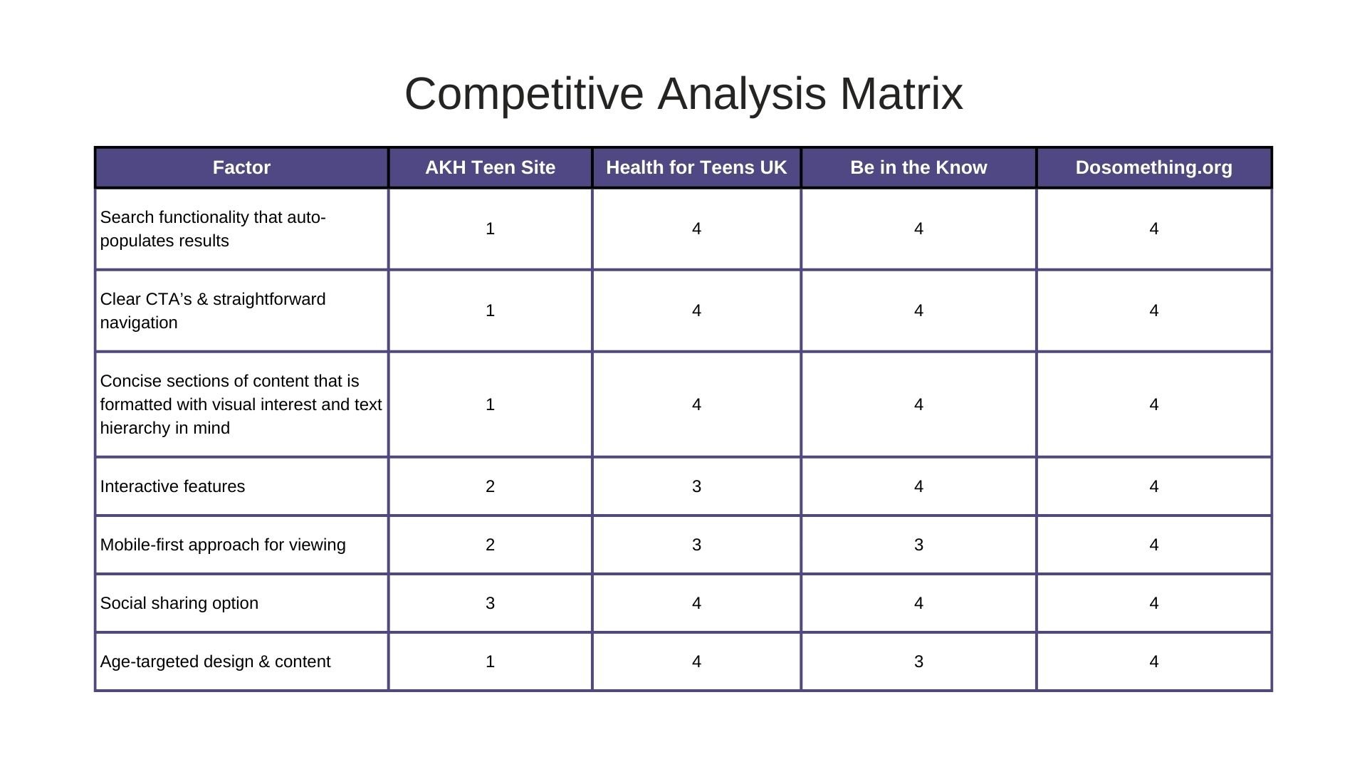
This analysis provided insights into design elements that appeal to teen audiences and improve usability, helping to shape the layout, structure, and tone of the redesigned website. Ratings for competitive analysis matrix: 1 = Major weakness, 2 = Minor weakness, 3 = Minor strength, 4 = Major strength)
Secondary Research
Nielsen Norman Group – "Usability of Websites for Teenagers"
I reviewed findings and insights from the Nielsen Norman Group's research to validate trends and hypotheses observed during the primary research phase. This served as a benchmark to align the redesigned site with established best practices for teen users.
Key Insights About the Target Audience
Behaviour: Teens are goal-oriented; they visit websites with specific objectives rather than browsing aimlessly.
Preferences:
Favour searches with auto-suggestions and are comfortable with scrolling.
Prefer neutral graphics over childish designs.
Appreciate small, divided sections, bulleted lists, and content in concise, digestible chunks.
Pain Points:
Dislike dense content, poor navigation, and small text sizes.
Overuse of animations and garish colours detracts from the experience.
Best Practices for Designing Websites for Teens
Use highlights or accent colours to focus attention (e.g., avoid high-contrast black-and-white text).
Display content in small, meaningful sections with plenty of white space.
Write in short sentences and paragraphs, and format key points or steps using bullet points.
Supplement content with relatable stories, images, or examples from teens.
Minimize heavy animations and avoid garish colour schemes that may work for younger audiences.
Include sharing options such as "copy link address" alongside social sharing buttons.
The identified trends supported the need for a prominent search functionality, simplified navigation, and visually appealing design tailored to teen preferences. The competitive analysis reinforced that successful teen websites prioritize content chunking, visually engaging layouts, and intuitive structures. Feedback from healthcare providers highlighted the importance of organizing content in a way that is accessible and easy to recommend to patients and families.


Ideation
Based on user research and feedback, I began exploring solutions through sketching different functionalities and features that could address the identified problems. Throughout this process, I collaborated with my managers, who provided valuable feedback and helped refine ideas to align with both user needs and business goals.
Design Recommendations
To enhance the user experience and improve engagement, I proposed the following design solutions based on our research:
Simplified Navigation: A clear, intuitive navigation structure to help users easily find relevant content.
Consistent & Readable Article Styling: Standardized typography and layout to improve readability and user experience.
Accordions for Lengthy Articles: Collapsible sections to make long-form content more digestible and user-friendly.
New H2 Subsections for Generic Health Articles: Organized key sections under headings like "What You Need to Know," "What You Can Do," and "Who You Can Talk To" for better content structure.
Recommended Articles in Footer: Featured article suggestions at the end of each article to encourage further exploration.
Interactive Learning Features: Highlighting engaging content on the homepage and introducing interactive elements, such as quizzes, to enhance user engagement.
Learning Hub Visual Enhancements: Improving the visual presentation of learning hub accordions with list vs. grid view options to enhance usability.
Prioritization & Decision-Making
Given stakeholder feedback, business goals, and project deadlines, as a team we prioritized the most feasible and impactful solutions. The final design focused on:
Simple & easy-to-use navigation
Consistent & readable article styling
Accordions for lengthy articles
New H2 subsections for generic health topics
Recommended articles at the footer
Highlighting interactive content on the homepage
These solutions aimed to improve content discoverability, enhanced readability, and create a engaging experience for teen users.


Design Process
Given the project's time constraints, I opted to jump directly into high-fidelity wireframes using Figma, focusing on structuring content before refining visual details. My approach was guided by inspiration from other health education and teen-centric websites, ensuring the interface was engaging, informative, and easy to navigate.
Visual Design & Colour Choices
To make the interface visually appealing to teens, I prioritized bold colours, engaging visuals, and strategic use of white space at key touchpoints, such as:
Hero banners
Article headers
Featured content sections
I selected a colour palette based on SickKids’ branding guidelines while incorporating lighter shades to be used as background colours for contrast and accessibility.
Design Elements & Accessibility Considerations
I incorporated rounded shapes (circles, curved-edged rectangles, wave patterns) to create a more youthful and engaging feel while ensuring visual consistency. This contrasted with a chevron background pattern to enhance readability and accessibility.
Key accessibility measures included:
Foreground & background colour contrast compliance for readability.
Avoiding full-size hero banner images with overlaid text to prevent legibility issues.
Ensuring the search function was keyboard-accessible for improved usability.
Using SickKids’ style guide for typography, colours, and layout decisions to maintain brand consistency.
Since the Teen site lacked a formal design system, I used this project as an opportunity to begin structuring a foundational design system for future updates.


User insights directly shaped the final design choices in several key ways:
Simplified navigation & searchability: Since 31% of teens search randomly for health content, we prioritized an intuitive navigation system and improved search functionality to help them find relevant resources faster.
Mobile-first design: With 87.5% of users accessing content via mobile, we ensured a mobile-optimized layout, touch-friendly interactions, and responsive design principles.
Engaging visuals & reduced text density: Users liked the color scheme but found some content too text-heavy. We introduced more visuals, iconography, and interactive elements to balance text-based information with engaging design.
Incorporating video & interactive learning features: Since 100% of users relied on YouTube, we added an interactive learning section on the homepage for ease of access to our video content, interactive modules and multimedia resources.
Readability enhancements: To break down long-form content, we implemented headings on general health related pages and condensed text as appropriately as we could with headings like “what you need to know,” “what you can do,” “who you can talk to.” Additionally, we improved typography choices based on readability guidelines from Nielsen Norman Group research, such as having headlines highlighted with a background colour.
All in all, we did have to make design decisions as a team that made sense to our current ecosystem, what our developers and the platform that we were using are capable of in the time we had and implement some of the design suggestions for later iterations of the website.
Usability Testing
To evaluate the effectiveness of our high-fidelity prototype, we conducted usability testing on three key areas of the website:
The redesigned homepage
The new learning hub
An example article page
We invited the same participants from our initial questionnaire, as well as members of the Children’s Council at the hospital—a group that included real patients who had used our website in the past or had been introduced to it through their clinical team. The usability tests were conducted over Zoom, where participants were asked to complete a series of tasks, including:
Navigating the website
Using the search function
Interacting with different content sections
Key Findings from User Feedback
What worked well:
The search function placement as the first touch point on the homepage was well-received.
The content layout was clear and concise, making it easy to scan.
Interactive content was easy to find directly from the homepage.
Highlighted headings improved discoverability of important information.
The "Explore More" section at the bottom of article pages encouraged further engagement.
The website felt friendly and inviting, thanks to the chosen fonts and colour scheme.
Areas for improvement:
Increase font size for better readability.
Use more representative images to enhance relatability.
This feedback provided valuable insights into how we could further refine the design to better align with user needs.
Results & Learning
As a result of our efforts, we successfully implemented the new design alongside our development team. However, we encountered a few technical constraints, particularly with introducing a grid layout, incorporating images in the desktop navigation, and applying colour-coded sections for different content types. Given our tight timeline and the upcoming platform migration, we decided to put these enhancements on hold for future iterations.
Despite these limitations, the redesigned website performed well post-launch. We saw improved conversion rates and received direct feedback from clinicians and users who found the new features significantly improved their experience. Our stakeholders were especially pleased with the updates to the Mental Health Learning Hub, as well as the overall enhancements across the site.
This project reinforced the idea that innovation isn’t always about complex solutions—often, users simply need intuitive and accessible experiences that make their journey easier. If we had more time and resources, I would have:
Conducted in-person usability testing with more frequent users to gain deeper insights into their interactions.
Developed a design system before starting the project to ensure efficiency, consistency, and scalability.
Created low-fidelity prototypes for early testing before moving into high-fidelity designs, allowing for faster iteration and refinement.
This project was a pivotal learning experience for me. Seeing firsthand how our content supports children and families navigating health challenges emphasized the real-world impact of UX design. It also sparked my interest in establishing a foundational design system for AboutKidsHealth and reconsidering the future direction of the main parent site.